
Creating a Drag-and-Drop File Upload Component in React: A Step-by-Step Guide


In today’s digital world, uploading files and images are essential feature of any application.
Whether you’re building a photo-sharing app, a document management system, or any application that involves dynamic-generated content, having a smooth and user-friendly file upload mechanism is essential. With drag-and-drop functionality, users can effortlessly add files to your application by simply dragging them from their file explorer and dropping them into your designated area.
In this article, you will learn how to implement a drag-and-drop component in your web app. Additionally, you will learn how to pass the user drop files to other components using props (child to parent).
Table of content
Prerequisites
What is Drag-and-drop (DnD)
How does Drag-and-Drop work in ReactJS
Create a Drag-and-Drop component in ReactJS
Conclusion
Prerequisites
Knowledge of React JSX
Knowledge of React hooks such as useState
Understanding of how props are being passed
A coding environment!
A ReactJS project already running!
What is Drag and Drop?
Drag and Drop is a convenient feature available in many modern systems. With this functionality, users can easily move files, text, or images from one window to another. While this feature is native to many systems, it has also been implemented in web applications with great success.
How does Drag and Drop work in React?
Drag and drop is a user interface interaction that allows users to move data or objects from one location to another by clicking, holding, and “dragging” the item with the mouse cursor, then releasing it (“dropping” it) at the desired location. This interaction is commonly used for tasks like rearranging items in a list, moving files between folders, and more. Here’s how drag and drop typically works:
Initiation: The drag-and-drop interaction begins when a user clicks and holds down the mouse button on a draggable item, such as a file, image, or element in a web application. During this phase, the item being dragged is known as the “drag source.”
Dragging: While holding down the mouse button, the user moves the cursor, causing the dragged item to follow the cursor’s movement. This creates the visual effect of the item being dragged across the screen.
Drop Target: To complete the drag-and-drop action, the user moves the cursor over a valid “drop target.” A drop target is typically an area or element that can accept the dropped item. For example, it could be a folder in a file browser or a specific location in a web application where the item should be placed.
Feedback: As the cursor hovers over a drop target, the drop target often provides visual feedback to indicate that it can accept the dragged item. This feedback can include highlighting, animations, or other visual cues.
Release: To drop the item, the user releases the mouse button. At this point, the system or application detects the drop event and processes it.
Handling the Drop: The system or application responds to the drop event. This typically involves moving or copying the item to the new location (in the case of file management) or triggering a specific action (in the case of web applications).
Create a Drag and Drop component in ReactJS
To create the DragNDrop component and its associated CSS file, navigate to your project folder and create two new files called DragNDrop.jsx and drag-drop.css. Keep in mind that this article assumes you already have a ReactJS project set up, so we will not go over how to create a new project.
To follow along copy the below CSS code and paste it into the new CSS file you created
.drag-drop {
  background: #fff;
  border: 1px solid var(--border-color);
  border-radius: 8px;
}
.document-uploader {
  border: 2px dashed #4282fe;
  background-color: #f4fbff;
  padding: 10px;
  display: flex;
  flex-direction: column;
  align-items: center;
  justify-content: center;
  position: relative;
  border-radius: 8px;
  cursor: pointer;

  &.active {
    border-color: #6dc24b;
  }

  .upload-info {
    display: flex;
    align-items: center;
    margin-bottom: 1rem;

    svg {
      font-size: 36px;
      margin-right: 1rem;
    }

    div {
      p {
        margin: 0;
        font-size: 16px;
      }

      p:first-child {
        font-weight: bold;
      }
    }
  }

  .file-list {
    display: flex;
    flex-direction: column;
    gap: 0.5rem;
    width: 100%;
    height: 30vh;
    &__container {
      width: 100%;
      height: 100%;
      overflow: auto;
    }
  }

  .file-item {
    display: flex;
    justify-content: space-between;
    align-items: center;
    padding: 0.5rem;
    border: 1px solid var(--border-color);
    border-radius: 8px;

    .file-info {
      display: flex;
      flex-direction: column;
      gap: 0.25rem;
      flex: 1;

      p {
        margin: 0;
        font-size: 14px;
        color: #333;
      }
    }

    .file-actions {
      cursor: pointer;

      svg {
        font-size: 18px;
        color: #888;
      }

      &:hover {
        svg {
          color: #d44;
        }
      }
    }
  }

  .browse-btn {
    display: flex;
    align-items: center;
    justify-content: center;
    padding: 0.5rem 1rem;
    border: 1px solid var(--border-color);
    border-radius: 8px;
    cursor: pointer;
    background-color: var(--primary-color);
    &:hover {
      background-color: transparent;
    }
  }

  .success-file {
    display: flex;
    align-items: center;
    color: #6dc24b;

    p {
      margin: 0;
      font-size: 14px;
      font-weight: bold;
    }
  }

  input[type="file"] {
    display: none;
  }
}
Remember to customize the styling to fit your application skin.
Next, open the jsx file and paste the below code
import React, { useEffect, useState } from "react";
import { AiOutlineCheckCircle, AiOutlineCloudUpload } from "react-icons/ai";
import { MdClear } from "react-icons/md";
import "./drag-drop.css";
In the code snippet above, we start by importing all necessary files, such as react hooks, icons, and stylesheet.
const DragNdrop = ({
  onFilesSelected,
  width,
  height,
}) => {
  const [files, setFiles] = useState([]);

const handleDrop = (event) => {
    event.preventDefault();
    const droppedFiles = event.dataTransfer.files;
    if (droppedFiles.length > 0) {
      const newFiles = Array.from(droppedFiles);
      setFiles((prevFiles) => [...prevFiles, ...newFiles]);
    }
  };
To enhance the versatility of this component, we can pass the files down to other components that might require them. Additionally, users can customize the size of this component. To achieve this, we need to create a single useState hook to store the files that the user has dropped.
To capture these dropped files, we create a function named handleDropThis function captures and stores the files that have been dropped. Since traditional form elements cause the page to refresh when the form changes, we call the prevent method on the event parameter to avoid this. Once a file is dropped, we can access it using the event.dataTransfer.files method. We convert this incoming object into an array using array.from(). Finally, we update the state with this new file array.
const handleRemoveFile = () => {
    setFiles((prevFiles) => prevFiles.filter((_, i) => i !== index));
  };

  useEffect(() => {
    onFilesSelected(files);
  }, [files, onFilesSelected]);
This code snippet above declares two functions. The first function removes the given file from the files array list, while the second function updates the props with a new file, whenever there are file changes.
 return (
    <section className="drag-drop" style={{ width: width, height: height }}>
      <div
        className={`document-uploader ${
          files.length > 0 ? "upload-box active" : "upload-box"
        }`}
        onDrop={handleDrop}
        onDragOver={(event) => event.preventDefault()}
      >
        <>
          <div className="upload-info">
            <AiOutlineCloudUpload />
            <div>
              <p>Drag and drop your files here</p>
              <p>
               Supported files: .JPG, .PNG, .JPEEG, .PDF, .DOCX, .PPTX, .TXT,
                .XLSX
              </p>
            </div>
          </div>

        {files.length > 0 && (
          <div className="file-list">
            <div className="file-list__container">
              {files.map((file, index) => (
                <div className="file-item" key={index}>
                  <div className="file-info">
                    <p>{file.name}</p>
                    {/* <p>{file.type}</p> */}
                  </div>
                  <div className="file-actions">
                    <MdClear onClick={() => handleRemoveFile(index)} />
                  </div>
                </div>
              ))}
            </div>
          </div>
        )}
      </div>
    </section>
  );
};

export default DragNdrop;
To use the functions above, each HTML div element has a property called onDrop, onDrag etc These properties listen for dragging events from the mouse pointer. To catch the drop files we pass in our handleDrop function on the HTML onDrop property.
With these functions, our drag-and-drop component is ready, but wait, there is more. Giving users the ability to drag and drop files are optional, there is always a button to select files manually. With that said, we need to update our code accordingly;
const handleFileChange = (event) => {
    const selectedFiles = event.target.files;
    if (selectedFiles && selectedFiles.length > 0) {
      const newFiles = Array.from(selectedFiles);
      setFiles((prevFiles) => [...prevFiles, ...newFiles]);
    }
  };
In this code snippet, we are declaring a handle file change on an HTML input element. Similar to our handleDrop function, we listen for changes on target.files instead of dataTransfer.files. We then update our state with the newly selected file. Finally, we return a JSX input element and attach our handleFileChange function.
return (
    <section className="drag-drop" style={{ width: width, height: height }}>

      // other jsx

          <input
            type="file"
            hidden
            id="browse"
            onChange={handleFileChange}
            accept=".png, .jpg, .jpeg .pdf,.docx,.pptx,.txt,.xlsx"
            multiple
          />
          <label htmlFor="browse" className="browse-btn">
            Browse files
          </label>
        </>

    // other jsx
      </div>
    </section>
  );
Find the full component code below
import React, { useEffect, useState } from "react";
import { AiOutlineCheckCircle, AiOutlineCloudUpload } from "react-icons/ai";
import { MdClear } from "react-icons/md";
import "./drag-drop.css";

const DragNdrop = ({
  onFilesSelected,
  width,
  height,
}) => {
  const [files, setFiles] = useState<File[]>([]);

  const handleFileChange = (event) => {
    const selectedFiles = event.target.files;
    if (selectedFiles && selectedFiles.length > 0) {
      const newFiles = Array.from(selectedFiles);
      setFiles((prevFiles) => [...prevFiles, ...newFiles]);
    }
  };
  const handleDrop = (event) => {
    event.preventDefault();
    const droppedFiles = event.dataTransfer.files;
    if (droppedFiles.length > 0) {
      const newFiles = Array.from(droppedFiles);
      setFiles((prevFiles) => [...prevFiles, ...newFiles]);
    }
  };

  const handleRemoveFile = (index: number) => {
    setFiles((prevFiles) => prevFiles.filter((_, i) => i !== index));
  };

  useEffect(() => {
    onFilesSelected(files);
  }, [files, onFilesSelected]);

  return (
    <section className="drag-drop" style={{ width: width, height: height }}>
      <div
        className={`document-uploader ${
          files.length > 0 ? "upload-box active" : "upload-box"
        }`}
        onDrop={handleDrop}
        onDragOver={(event) => event.preventDefault()}
      >
        <>
          <div className="upload-info">
            <AiOutlineCloudUpload />
            <div>
              <p>Drag and drop your files here</p>
              <p>
                Limit 15MB per file. Supported files: .PDF, .DOCX, .PPTX, .TXT,
                .XLSX
              </p>
            </div>
          </div>
          <input
            type="file"
            hidden
            id="browse"
            onChange={handleFileChange}
            accept=".pdf,.docx,.pptx,.txt,.xlsx"
            multiple
          />
          <label htmlFor="browse" className="browse-btn">
            Browse files
          </label>
        </>

        {files.length > 0 && (
          <div className="file-list">
            <div className="file-list__container">
              {files.map((file, index) => (
                <div className="file-item" key={index}>
                  <div className="file-info">
                    <p>{file.name}</p>
                    {/* <p>{file.type}</p> */}
                  </div>
                  <div className="file-actions">
                    <MdClear onClick={() => handleRemoveFile(index)} />
                  </div>
                </div>
              ))}
            </div>
          </div>
        )}

        {files.length > 0 && (
          <div className="success-file">
            <AiOutlineCheckCircle
              style={{ color: "#6DC24B", marginRight: 1 }}
            />
            <p>{files.length} file(s) selected</p>
          </div>
        )}
      </div>
    </section>
  );
};

export default DragNdrop;
Use the Drag-and-drop component in another component
The beauty of React is that it allows for component reusability and modularity. This helps keep the codebase clean and avoid redundancy.
import DragNdrop from "@/components/DragNdrop";

function App () {
const [files, setFiles] = useState([]);
return (
    <div className='section'>
    // other jsx
     <DragNdrop onFilesSelected={setFiles} width="300px" height='400px'/>
    // other jsx
    </div>
  )
}

export default App;
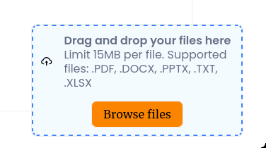
If you followed the above code snippet correctly the result below is something similar!
Conclusion
In conclusion, a drag-and-drop feature allows for easy file uploading in a web application, it allows users to achieve a goal faster and gives a good impression of a User Experience. Additionally, It enhances the user experience by providing a more intuitive and user-friendly interface.
That’s a wrap, drop your feedback in the comment section!